


Designing the in-car digital experience for the luxurious 2018 Lincoln Navigator
I was fortunate to be part of this project for Lincoln’s luxury HMI and integrated digital experience at Native SF. While the complete design included vehicle instrument cluster, HUD, rear displays and center console infotainment system; I worked mainly on the instrument cluster, on two tracks: a) production, after visual language definition and guided by the technical specs; b) concept generation, to expand on the brand’s principles.
The scope of this project was much larger than what I showcase here, and had many more people involved. I highlight the team I worked with directly, for this portion below.
Challenge: translate Lincoln’s brand principles into an elegant extension of their visual language and user interface. For the instrument cluster in particular: achieve a premium luxury feel, combining function, aesthetic and intuitive control.
Solution: a cohesive experience for the Lincoln’s vehicles. An elegant and distinct look & feel; with clear hierarchy, rich 3D graphics and animations, delivering a unique luxury experience.
____________________________________________________________
Year: 2016
My role: Visual UI designer
Core team: Jen Hong and Mike Hambleton (Lead designers), Nick Jonkman (Lead motion designer), Soonjae Kwon (Industrial designer, 3D modeling)
Creative Director: Thomas Moeller
Agency: Native, San Francisco
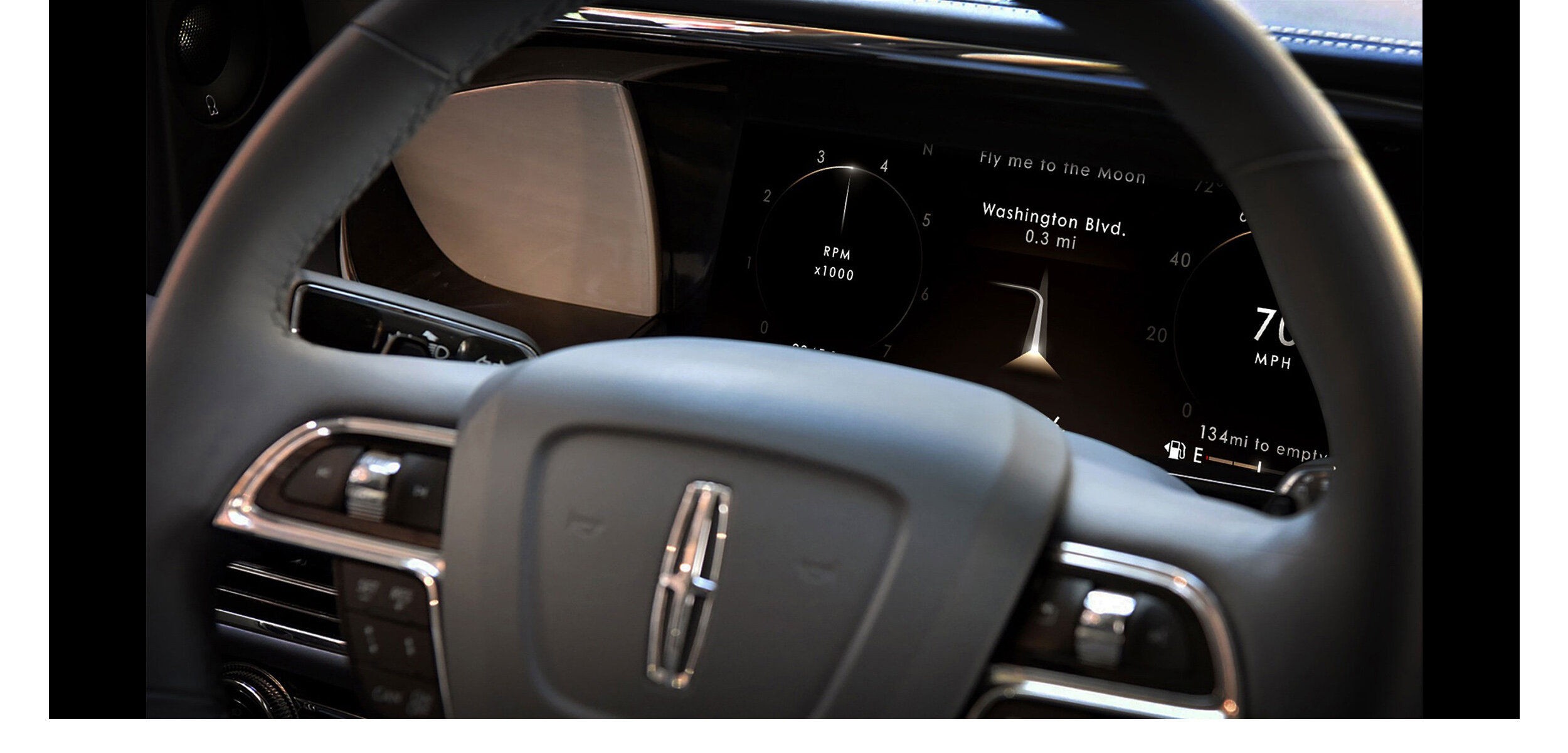
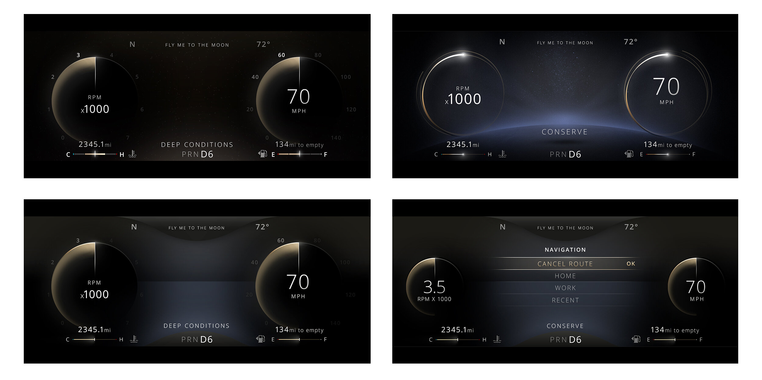
The images below, from left to right, show examples of the cluster’s 'normal' driving mode; the single dial view; maximized dials; and minimized dials with menu. These, and many other screens, with multiple states and variants, needed an extreme attention to detail for pixel perfect execution.
The digital on-screen language feels contemporary and modern, bordering on minimal; while highlighting function effectively, and remaining refined in its simplicity. The dynamic dials expand and contract, with fluid content adaptation and clear hierarchy throughout.
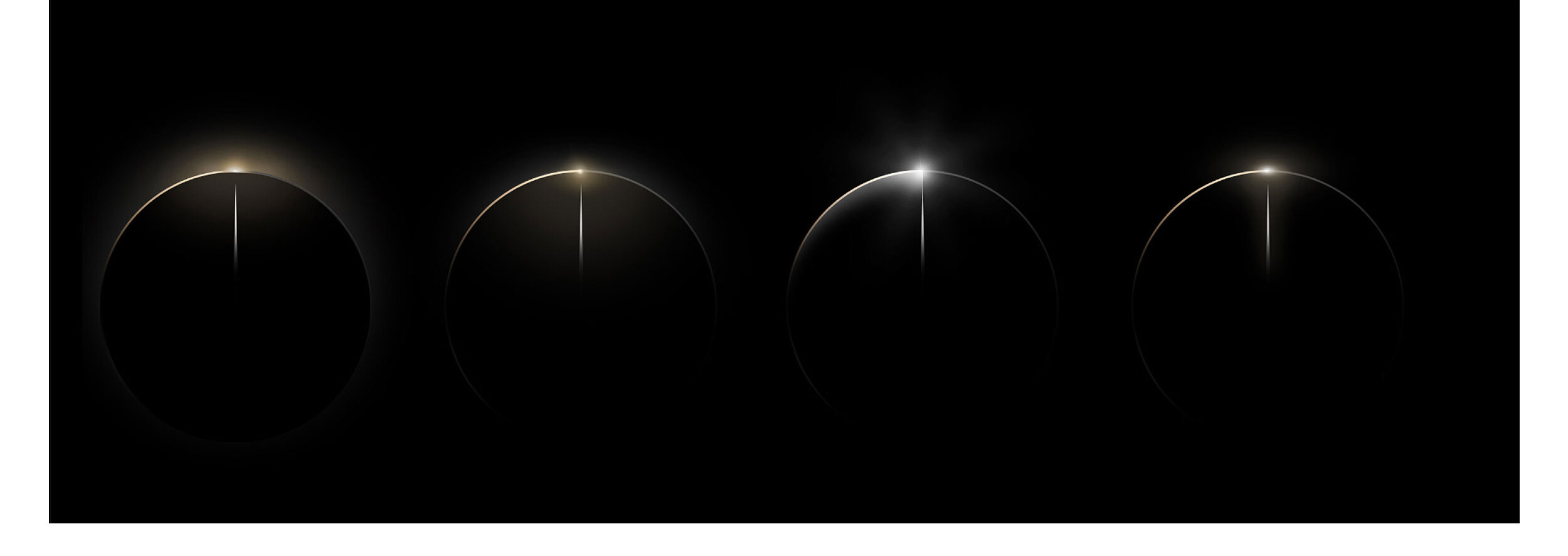
For visual design refinement, I worked on different variants for the flare, with distinct shapes, tonality and light intensity.
The main challenge when designing a cluster is the technical specifications, space available on screen, and contextual icons (information that is not meant to be visible at all times, but needs considered space and treatment for the different scenarios). Accessibility and legibility are the number one priority; after all, we’re designing for someone who is driving, and needs to, at a glance, find what they need behind the steering wheel. Our challenge was to work within those constrains, and execute on an interface that is accessible and functional but still unique.
In parallel with the production work, we wanted to explore the current visual language further: the Lincoln brand is about high end, serene luxury, atmospheric and ambient UI. Most vehicles have video-game graphics and bright coloured 3D interfaces, but we wanted calm and refined, not too ‘futuristic’, (the realm of Ironman HUDs and oblivion-type graphics were not appropriate).
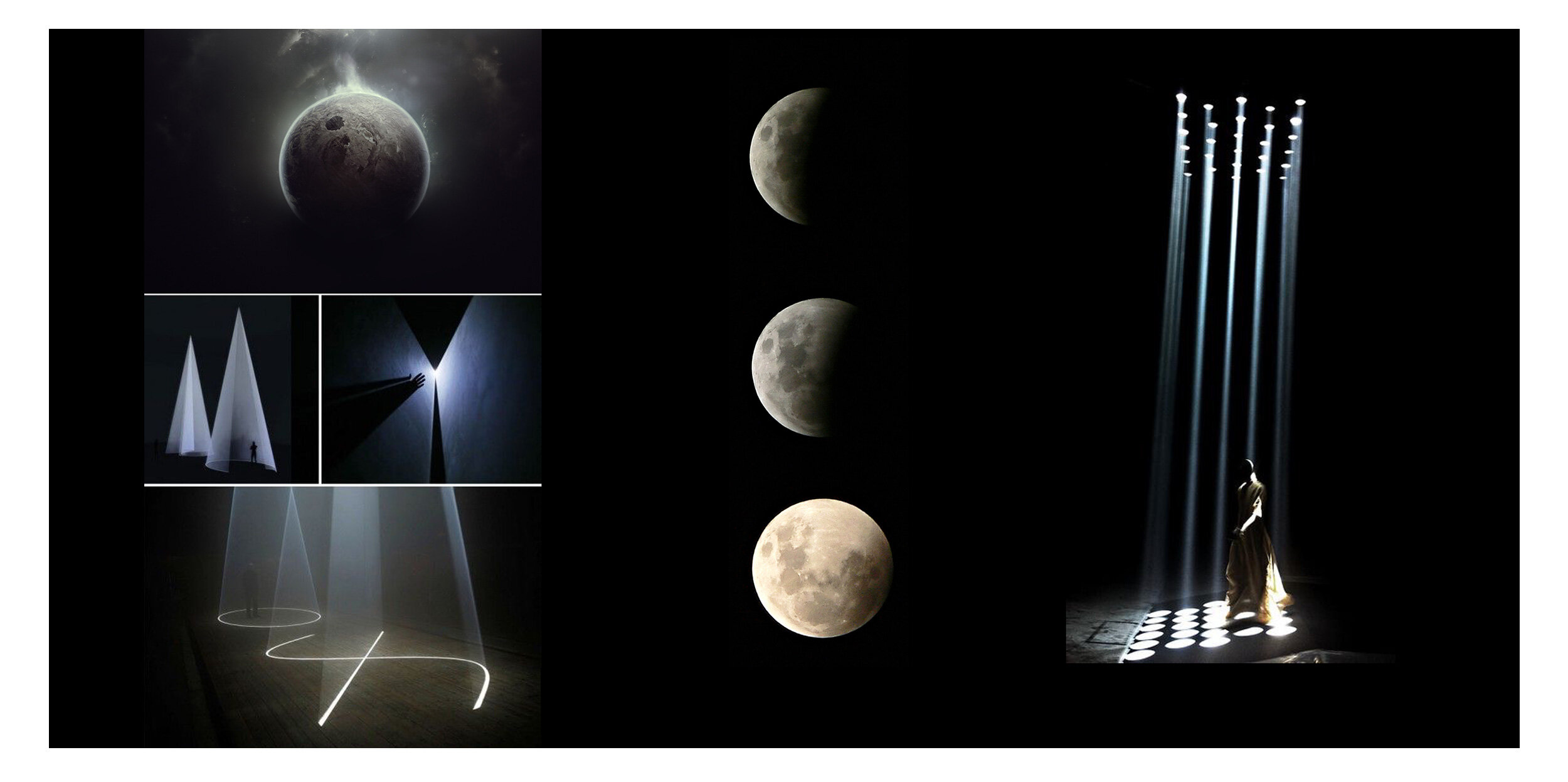
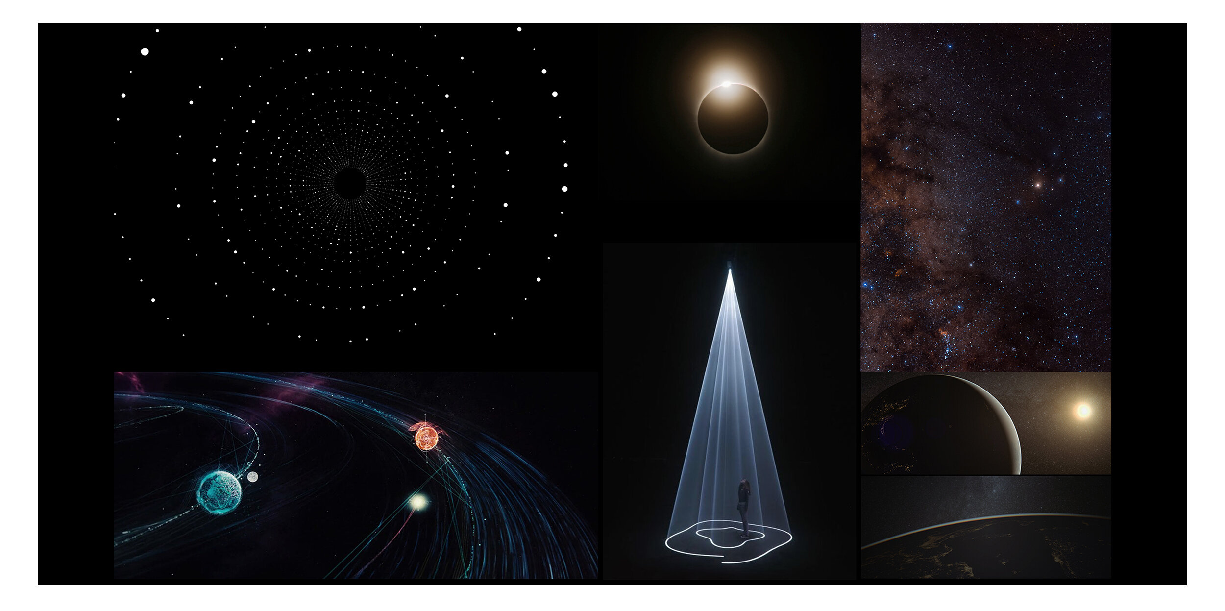
To translate the “Quiet Flight” aesthetic and visual attributes, such as serene luxury, ambient, artistic, and illuminating, into tangible UI elements; I drew inspiration from atmospheric lighting and focal points, the moon's silhouette and natural phenomenon such as stars, flashlights and planetary orbits, to create different representations of the dials shown below. These preliminary explorations are often purposefully “extreme” - to push boundaries and creativity - and usually need a step back later in the process, to meet usability and feasibility realities.
Looking at images of natural phenomenon to inspire the design language, these explorations meant to feel like a natural evolution of the existing design. In this new approach, lighting and tints are more prominent (i.e. the matte gold, and frosted blue), the dials resemble a moon’s silhouette; or on a more abstract / conceptual version, planetary orbits, where a gravitational path displays MPH and RPM values without the need of a needle.
Prior to exploring the cluster’s dials, gauges, and flare variations, I also experimented with different iconography styles for the various modes and themes. Below is one of those initial studies.
It was amazing to work with the San Francisco team at Native, and have the opportunity to contribute to this project. In terms of impact, the Lincoln’s SUV has received some of the highest industry praise for its HMI experience, and buyer ratings, to date. The Lincoln Navigator 2018 was also awarded American Truck of the Year.